Cool Workflows: Overworld vs Town Layouts
So, I'm wired due to new medication and I figured this might be a cool time to show off something I've done for Chapter 2; but moreover to discuss something I wanted to do as a polish piece throughout the creation of Knight Shift:
Overworld Town Designs Matching their Maps
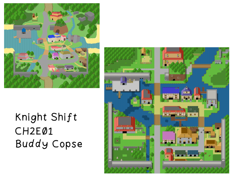
If you've finished the Knight Shift Chapter 1 Demo then you know that our adventurers are headed overseas to the forest town of Buddy Copse. There's going to be a lot to do there, and the town is larger in scope than Londo by about 50%; I really wanted this town to feel cosy and like it exists in the world. So, after deciding the broad strokes of the activities and quests available there I set out to do what I usually do, creating the map for the area, and then reflecting that on the overworld.
Something you may not have noticed during Chapter 1 is that this is the case for everywhere available from the overworld (with the exception of Crabbu Crabbu beach):
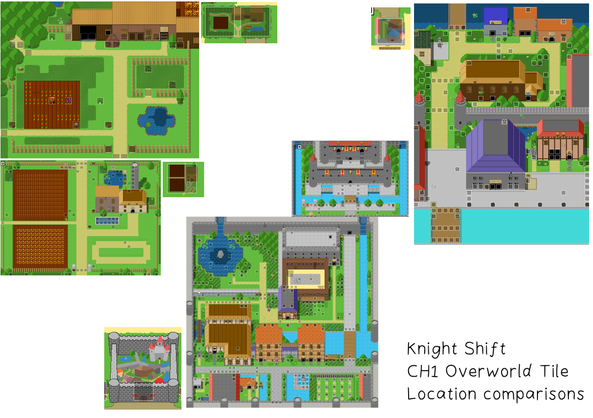
What I will say though is that I have no tried this hard to make the area a one-to-one recreation of an area in terms of scaling and the shape of the area. Londo was a standard square town, Port Beeswax was a square, but I used a line of pixels to indicate the river, and called out large structures, and the farms on the map I made sure matched up the shapes of their fields. This is something I intend to keep going in an effort to try and increase immersion, and to cement the layouts of these places in players' minds.
THE WORKFLOW
First thing I did was grab a screenshot of the layout of the area, then sketch out the shapes over the top of an unused area of the RTP spritesheet I had used for blocking out Chapter 2. That allowed me to select the 5x5 area I wanted to replace. I then began replicating the shapes of the terrain and buildings in paint.net:
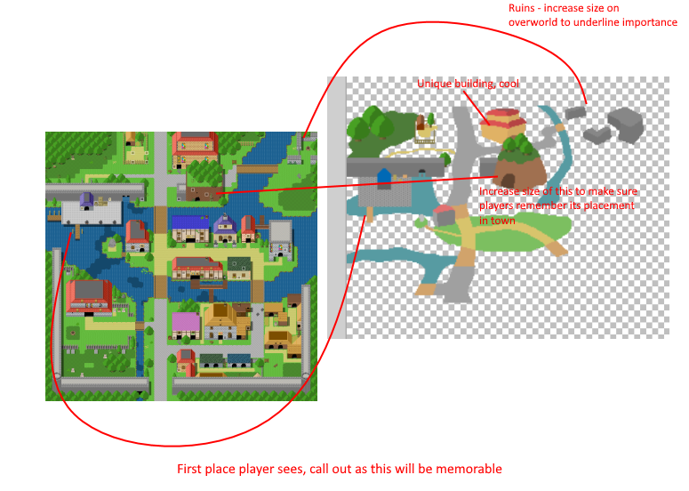
By exaggerating key landmarks and weighing them against the importance of their intended usage in the plot relative to the other buildings in the tileset I have tried to get the player to notice and value key areas, hopefully causing them to want to check them out in future.
Once this was complete I had this:
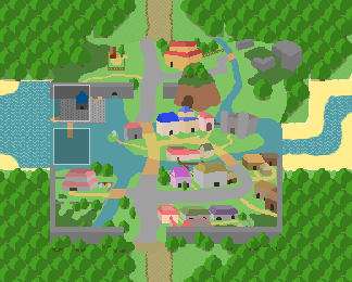
As you can see it matches the town's layout, but cut off various elements in the map and did not have tie in to the surrounding tiles perfectly. Implementing it in this form however allowed me to take a screenshot and overlay that over the tileset - World C - so that I could then touch the tileset up, ensure that the patterns for the water matched, ensured that all of the beaches tapered off in a way which looked pleasing, and cut out holes for existing trees to ensure things looked layered correctly, giving us:
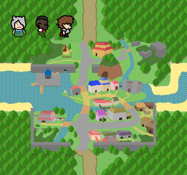
There's still the potential for additional polish: Matching the subtle pattern on the grass, but I'm worried about betraying the scale of the place. For now, I'm happy with the way this looks and am going to continue this workflow for all towns. I just thought that given how much more noticeable this 25 tile town was than anything I'd done in Chapter 1 it'd be worth documenting the workflow here in case it was useful for anyone!
If you got this far - thanks for reading! Looking forward to pushing out Chapter 2... At some point!
Leave a comment
Log in with itch.io to leave a comment.